
Zeze is a chocolate company from Montreal, QC. The owners are a third generation of Brazilians. They produce craft chocolate, using the finest fair trade cacao beans from Bahia, Brazil.
For the main logo I chose a "Tucan" because is one of the birds that represents Brazil. I decided to use gradients for the logo to express the feelings of summer, colors and happiness.
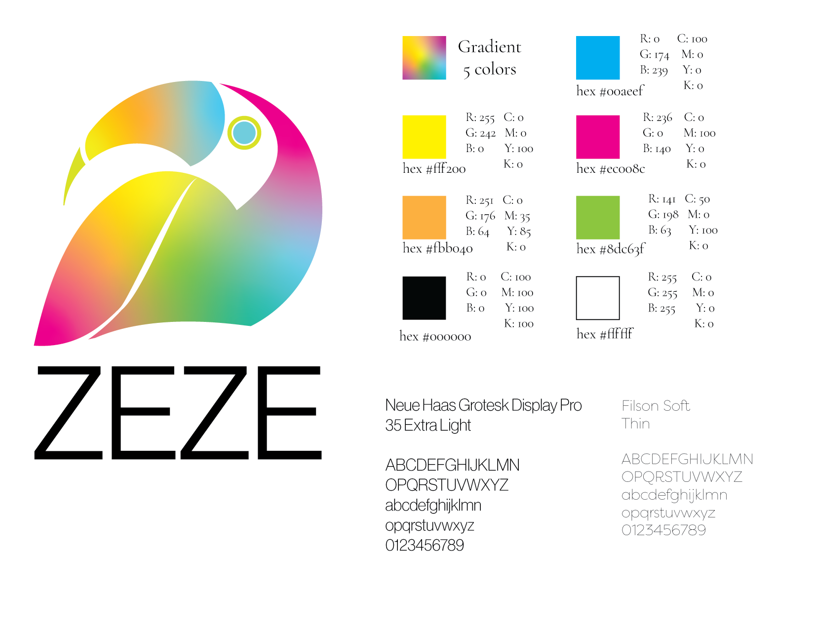
The colours use for this brand are summer colours that represent some cities in Brazil. Black is used as a background colour to keep the elegance and seriousness of the brand.
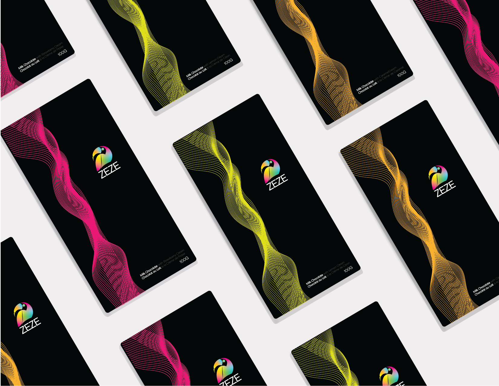
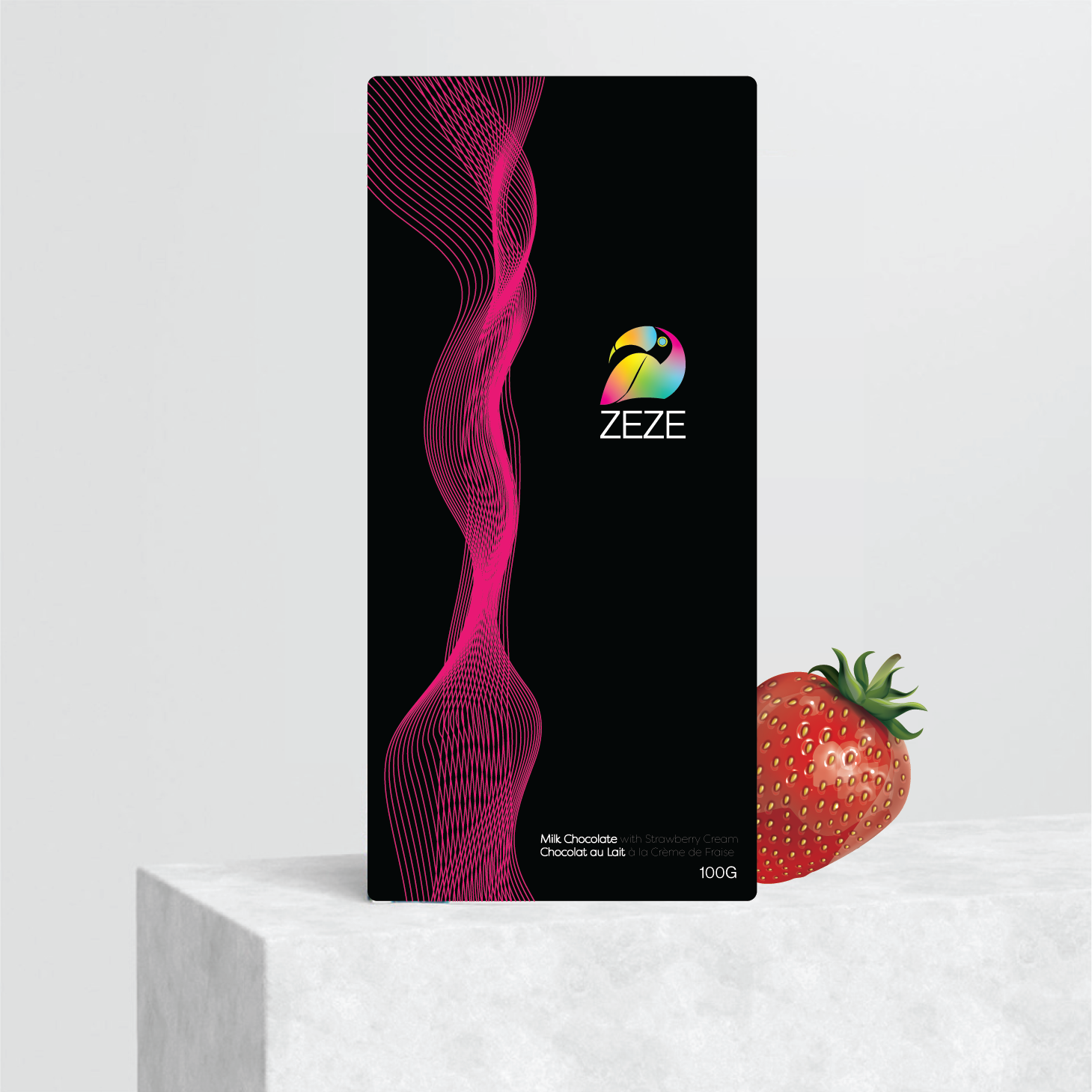
Their latest selection features new flavours such as strawberry, lemon and caramel. This selection was inspired in the drinks and fruits that people consume when they go to the beach.
I wanted to showcase the flavour of each chocolate by changing the color of the lines for the color of the flavour.
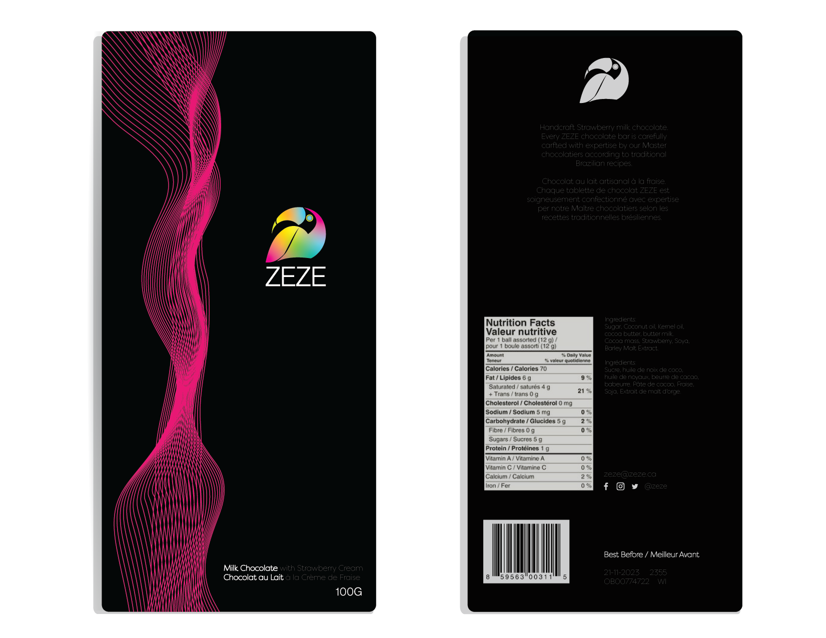
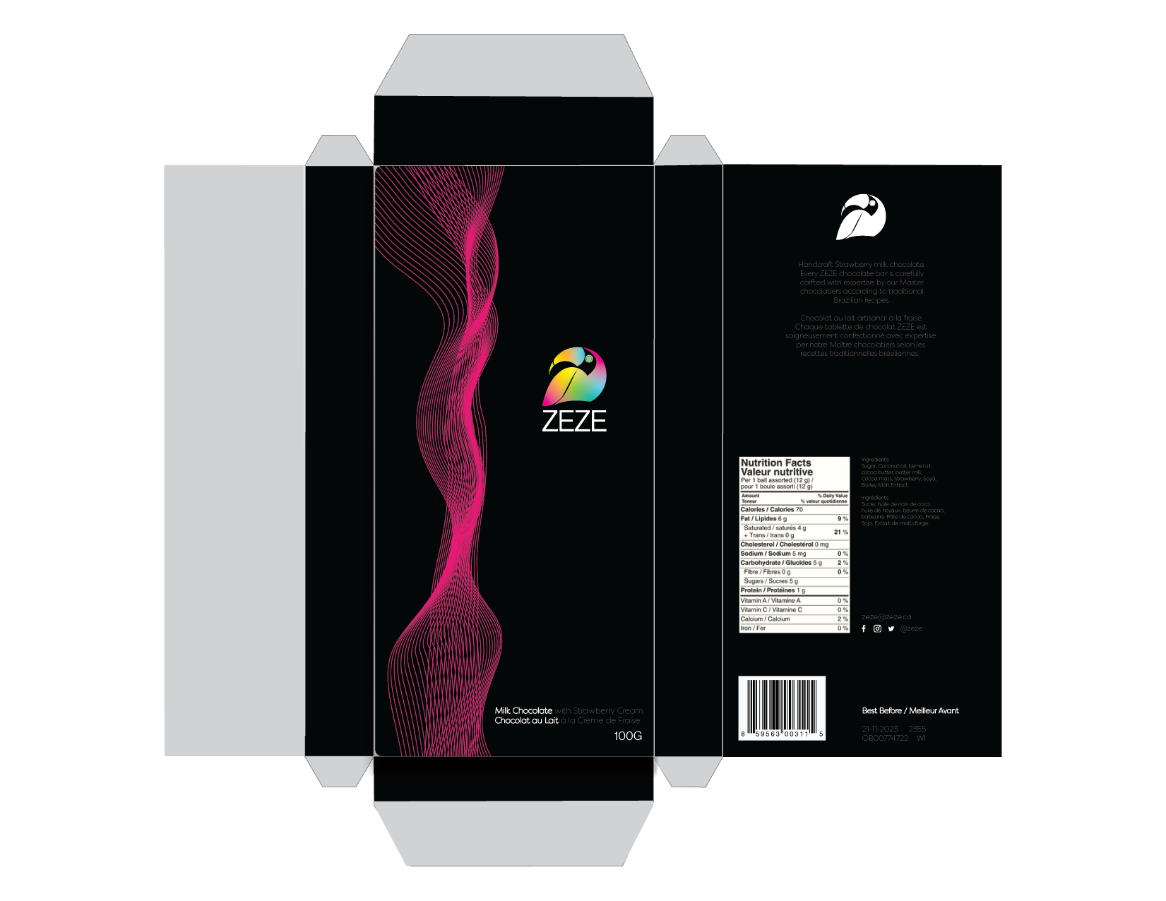
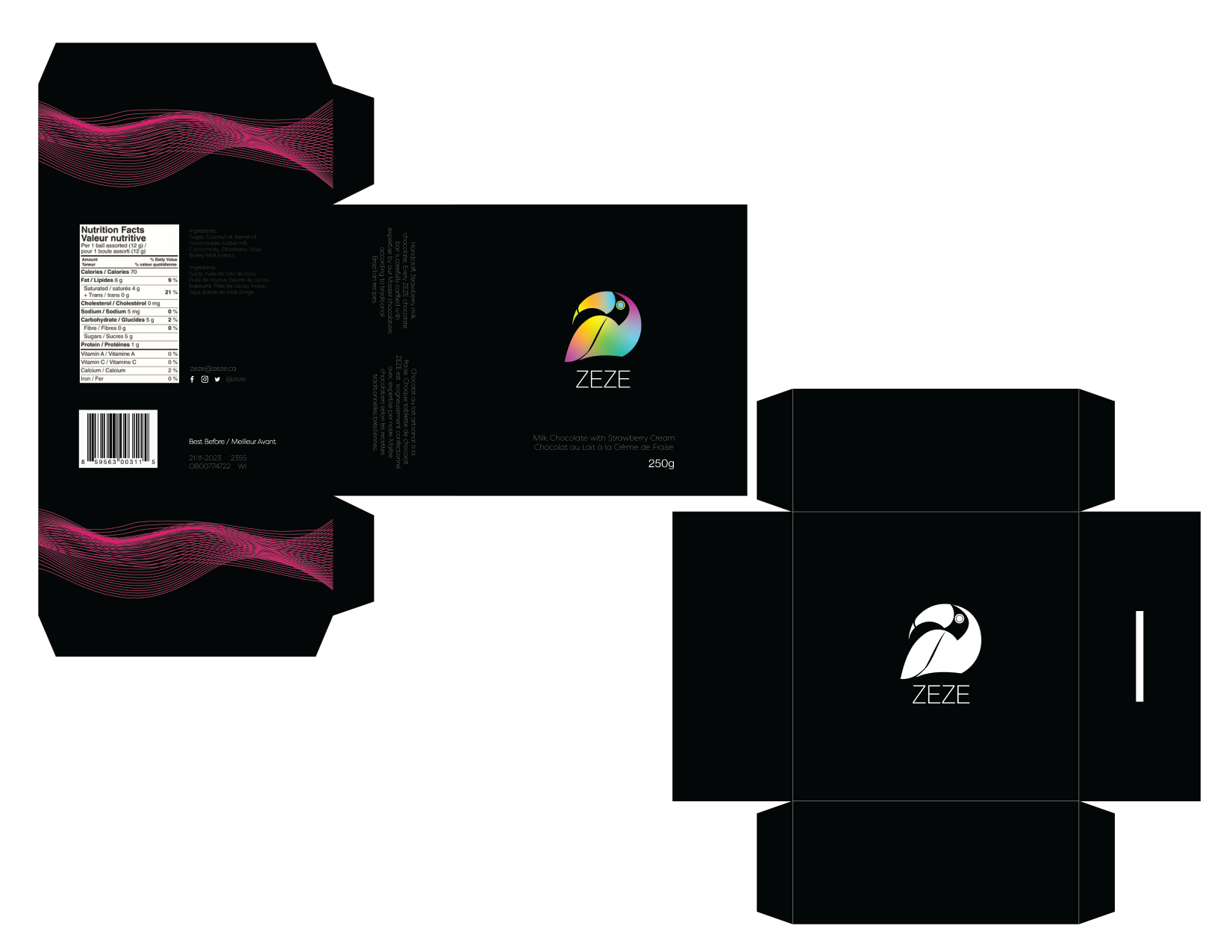

Packaging - the main challenge was to maintain the simplicity and elegance of the brand while making the packaging bilingual (French and English). I wanted to provide this brand with a more sophisticated and elegant look that will reflect the quality of ingredients and work put into each handcraft chocolate.
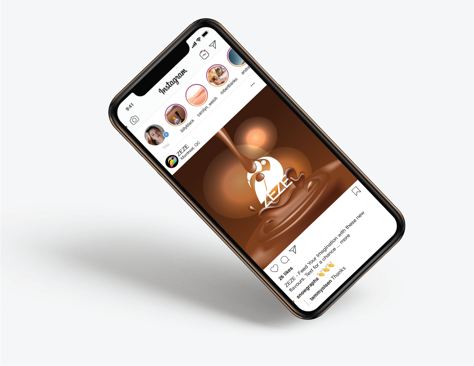
Social Media ad - will be kept simple by showcasing the chocolate in a liquid state to provoke people and make them feel the need to buy the chocolate and taste it.
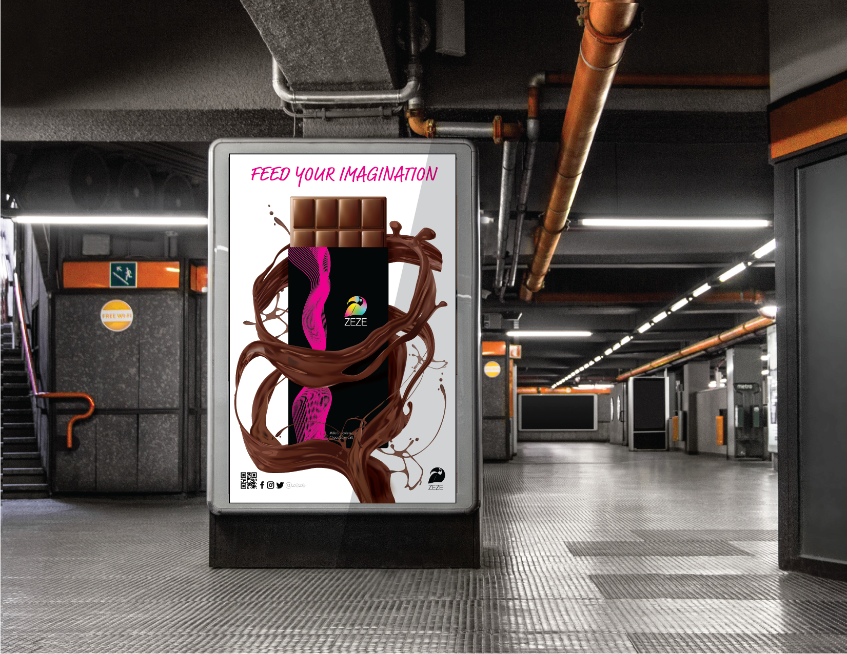
Street ad - I chose to make it simple and clean by only using one chocolate bar wrapped with our liquid chocolate. This image is big enough for people to see it from far away. The main tagline is inviting people to try it. The packaging in the ad will help people memorize and identify the brand easily.
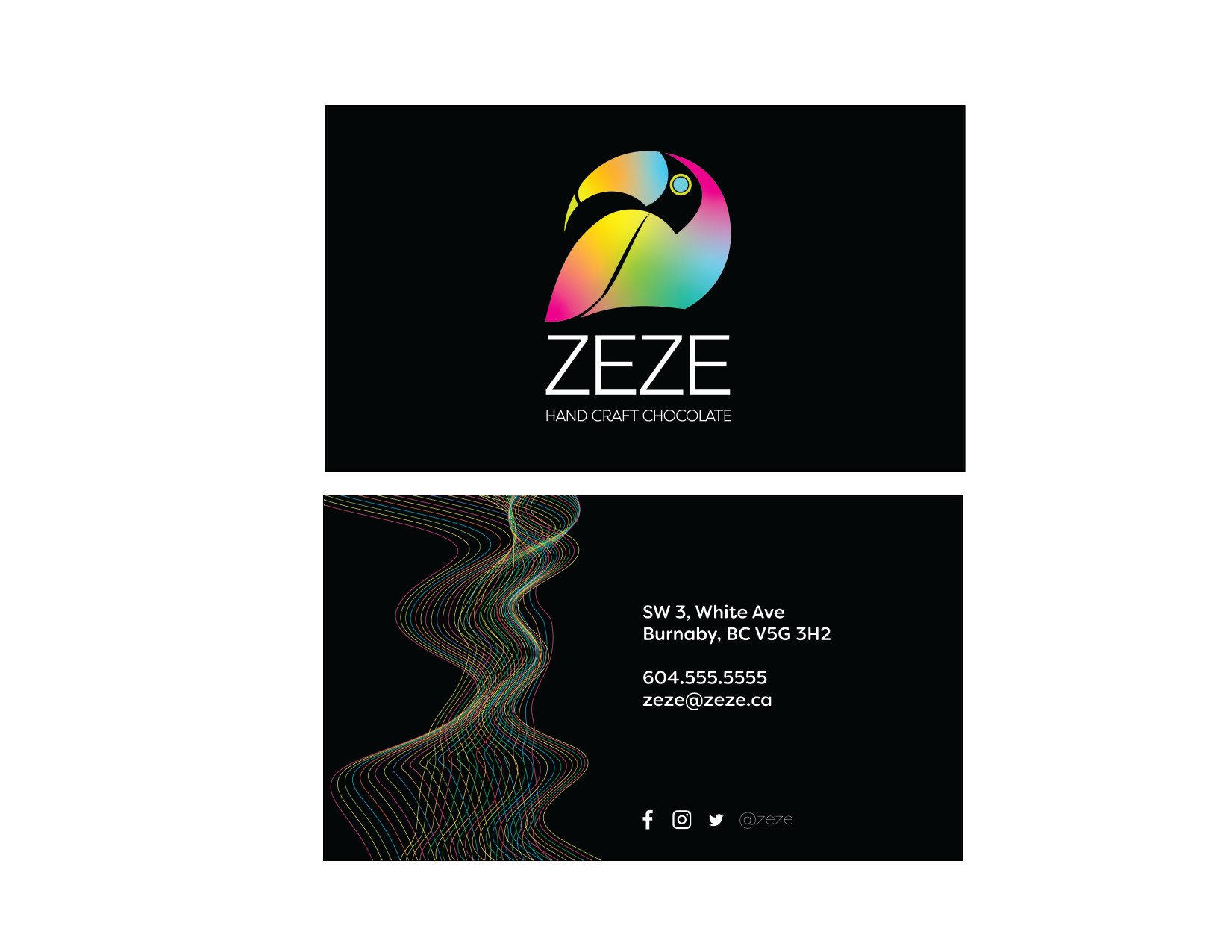
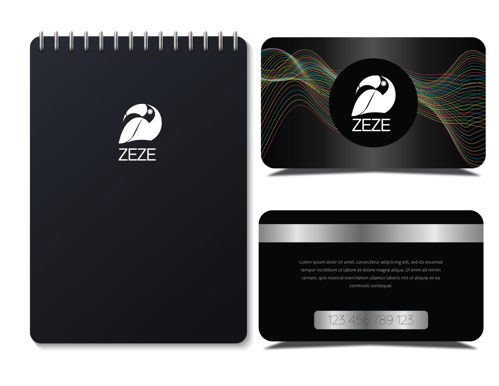
Business card will be available in the store for people to remember us and contact us to order. Accessories such a gift cards and notebooks will be available for sell.
Programs used: Illustrator & Photoshop